How to choose the best chart type
“There is a magic in graphs. The profile of a curve reveals in a flash a whole situation — the life history of an epidemic, a panic, or an era of prosperity. The curve informs the mind, awakens the imagination, convinces.” Henry Hubbard
The origin of charts
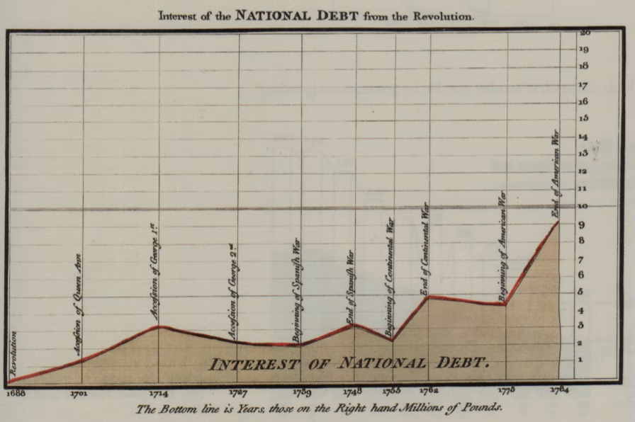
William Playfair was a Scottish Engineer and Political Economist. As a secret agent, Playfair reported on the French Revolution and organised a clandestine counterfeiting operation in 1793 with the aim of collapsing the French currency.
When he wasn't busy spying on the French, Playfair also invented the line chart, the area chart and the bar chart in 1786. And then the pie chart in 1801.
The chart above was intended to communicate the perils of financing war with increased national borrowing.
It's hard to imagine that prior to Playfair, nobody had thought of representing data this way.
In this session, we're now going to take a look at the charts that Playfair invented to see which chart is best for which job.