

Jul 21, 2026, 11:13:06 AM
Fed up of having to change every chart you create? Then this article is for you!
These days Excel does a pretty decent job at creating a presentable chart. But there are always a few things to tweak, and if you have a house style then you will find yourself making the same changes every time you create a chart.
Some fairly consistent changes are
➡️ Remove field buttons
➡️ Remove the gridlines
➡️ Remove the legend
➡️ Remove the chart title
➡️ Add tick marks to the axis
Introducting the Chart Template
We can very easily automate all of these steps by using a Chart Template.
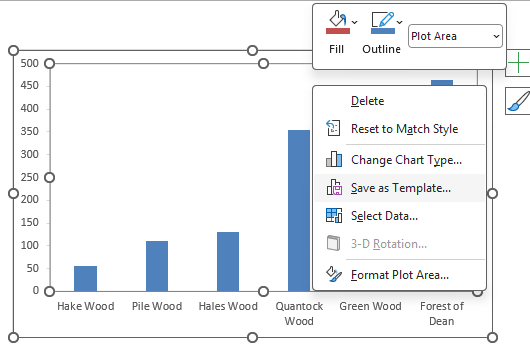
Once you have you perfect chart, simply right click and save it as a template:
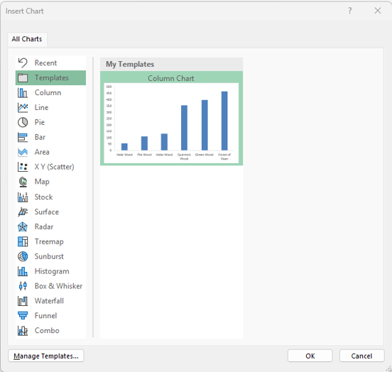
The next time you want to create a chart you can then select the template from the list:
Let's take a look at a walkthrough