
Do you find yourself making the same changes every time you create a PivotTable?
Pivot Tables are one of the best pieces of functionality in Excel. No argument.
There are however a few little annoyances in the default settings. The biggest one of these for me is the report layout called compact form, shown below:
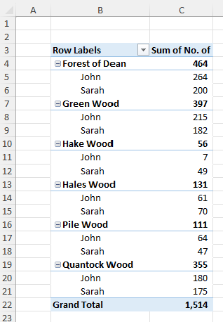
Now, I understand the benefit of this layout when you expand and collapse the segments using the + and - symbols, however this is greatly outweighed by the fact that the totals sit above the numbers they sum up. To me this is just wrong and far too risky.
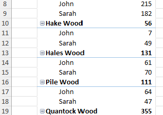
Take the image below, it looks like Hake Wood should be 215 + 182, which obviously isn't 56.
Luckily there is a much better layout, the Tabular form.
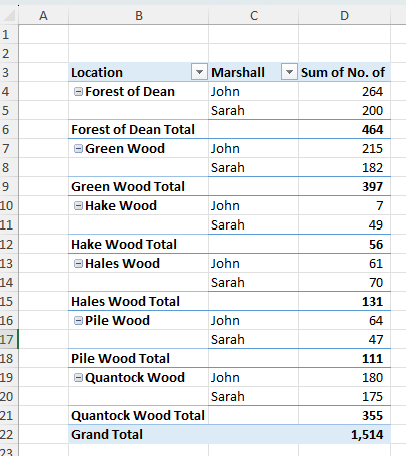
You can still expand and collapse the segments, and now the totals just make a lot more sense.
Let's take a look at a walkthrough
Personalising your PivotTables
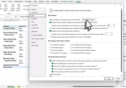
As you will have just seen in the video you can also edit the default layout for your PivotTables vias the Excel Options menu.
Make the changes once and you will have perfect looking PivotTables every time!